We publish statistics on topics including punctuality, cancellations, compensation claims, station usage and much, much more to provide passengers and the rail industry with information they can use.
One of our most recent publications was on the punctuality and reliability records of passenger trains and the main causes of delay. For the first time that statistical release used a new ‘on time’ measurement that records when trains arrive at stations within one minute of the schedule, instead of the previous measure which recorded a train as being punctual if it arrived at its final destination within five minutes of the schedule (10 minutes for Long Distance operators).
We have also made the news more usable with interactive charts which allow users to look at how individual train operators have performed over the past five years and see how much delay is attributable to them, how much is due to Network Rail infrastructure such as points and signals, and how much is caused by things like extreme weather or trespassers on the track.
Navigate the charts
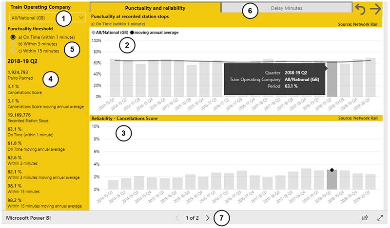
Expand the charts by clicking the 'right-pointing arrow' in the top right corner. All filters applied to the charts can be cleared by selecting the 'anti-clockwise' arrow.
The charts are set to show data for all passenger train operators. The data can be filtered using the train operator dropdown (1). This controls the data presented in the two charts: punctuality at recorded station stops (2) and reliability – cancellations score (3). It also controls the statistics presented on the left side (4) for the quarter selected from one of the charts. The lateness tolerance for the punctuality chart (2) can be altered by selecting one of the three punctuality thresholds (5).
The delay minutes chart and commentary can be viewed by selecting the tab (6). Alternatively, the arrows (7) allow the two pages to be toggled between without the train operator filter being cleared.
Delay minutes
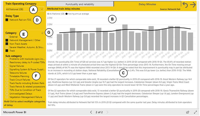
The train operator dropdown (A) controls the data presented in the chart (B) and the commentary, providing an overview of performance, beneath it (C). The chart data can also be filtered by delay type - Network Rail or train operators (D), category (E) and sub-category (F). For example, in the image above, the data have been filtered to show delay minutes attributed to Network Rail excluding those in the external (e.g. trespass incidents) and severe weather, autumn and structures categories. These filters can be cleared by selecting the eraser icon to the right of the filter heading (G).
Please tell us what you think of our new charts at rail.stats@orr.gov.uk.


